Lindelin / Visual identity
The origins of our work, in one mark
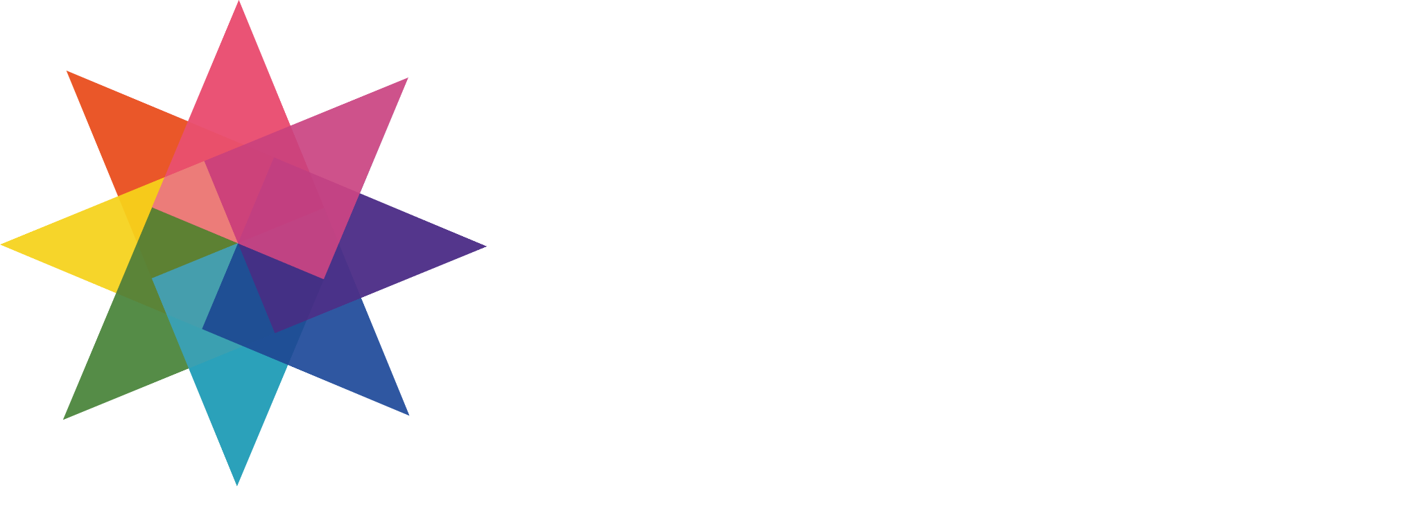
An eight-pointed star, a melody and a dot. Our logo brings together how we see the world and the connections we find between music, visual design and systems.
- Creative
The star / Creation unfolding
Eight directions extend from a shared center, leaving room for cultures, media and ideas to meet.
- Lindelin
The wordmark / Music at the origin
By choosing a name meaning melody, we keep music at the heart of our visual identity.
- Creative.Colors
Dot notation / Connecting our work
The relationship between a class and its members becomes a way to connect many expressions to one creative source.
01 / Eight directions
Open in every direction. Connected at the center.
Our eight-pointed star takes inspiration from the Chinese expression 四面八方: all directions. The four cardinal directions and the four between them describe the world around us. We see this as an invitation to look beyond a single viewpoint and consider our place within a larger whole. The eight points are not a count of our business categories; they express openness.
We also draw on Chinese traditions of thinking about the heavens, the earth, people and order together. Direction has served not only to describe space, but also to relate astronomical observation, time and architectural planning. What we take from the idea of harmony between people and nature is a relational perspective: finding our place through our connections to nature, culture and other people.
In the mark, eight directions reach outward while sharing a center. We wanted both breadth and coherence: room for difference, and a structure within which differences can coexist. Music, games, visual work and systems can develop in different directions without becoming isolated practices. This is the meaning we give our star, rather than a universal reading of the shape.
Cultural context: The Palace Museum · Direction, time and spatial design ↗02 / Origami
The possibilities within a single sheet
The star’s visual language begins with Japanese origami. We are especially drawn to the constraint of transforming one square sheet without scissors or glue. Within that limited material, the placement, direction and sequence of folds can produce an extraordinary range of animals, plants and objects.
We borrow the thinking behind folding, not the silhouette of a particular origami model. Straight lines divide planes; changes in direction make points; overlaps suggest what lies in front and behind. These geometric relationships give a flat symbol the feeling of something folded and opened.
Folding also connects, for us, to the care given to wrapping and putting things away in everyday Japanese life. We find beauty in that attention to squares and straight edges: working thoughtfully with the material already present, and allowing one change of direction to transform the whole.
Cultural context: Web Japan · The history of origami and ceremonial folding ↗03 / Transparent colors
Where colors meet, depth appears
The star is also a set of translucent color swatches, rotated and layered. Unlike an opaque shape that conceals what is beneath it, each translucent plane lets the underlying color remain part of the image. Individual edges stay legible while their intersections create new color relationships. This is how we bring transparent depth to a fold-like structure.
Looking through colored material draws attention to its interaction with other layers, the surface beneath and light. We translate that way of seeing into a flat graphic. The intention is not to simulate the optical properties of a particular material, but to preserve the sense of two layers being present at once. Color becomes a clue to depth, not simply a fill.
The overlaps also express how we work across disciplines. Musical rhythm can inform an interface; visual layering can suggest a way to organize a structure; systems thinking can help complex forms of expression work together. We do not need to dissolve these experiences into one uniform color. Their differences are what make new combinations possible.
04 / Lindelin
A name for a melody
Lindelin comes from the vocabulary tradition of Tolkien’s Quenya. Modern Neo-Quenya references list it as “melody, tune,” tracing it to an Early Quenya entry. We chose it because a melody has structure, yet reaches us directly as a feeling.
A melody contains distances between notes, development, pauses and returns. It also carries emotion that rules alone cannot explain. This is one starting point for how we understand creation. Even when a work makes no sound, our attention to rhythm, relationships and feeling remains.
The star holds the outward movement of creation, while the word Lindelin retains our musical origin. One opens directions; the other gives them a voice. We want them to speak together, without either replacing the other.
Etymology: Eldamo · lindelin (melody, tune) ↗05 / Creative.Colors
The dot has a purpose
Creative.Colors borrows dot notation from programming. In our naming concept, Creative is the class and Colors is the member accessed or called through it. The dot connects creation to the colors it can unfold. These are not two decorative English words: they describe a relationship.
Colors is deliberately plural. It refers both to the colors in the mark and to the many possibilities emerging from one creative origin. The capitalization and the dot are part of the name itself.
We chose a programming metaphor because system architecture and software development are also part of our creative practice. Just as one logo can speak of melody, color and structure, we can bring musical sensitivity, visual judgment and development thinking to the same work.
06 / Proportion & space
Order in proportion and space
We used golden-ratio and silver-ratio guides as references when composing the identity. The relative sizes of the symbol, wordmark and Creative.Colors, the distances between them and the surrounding space were calculated and arranged. We wanted the vivid star, expansive lettering and light handwritten strokes to retain their own voices within a coherent whole.
Proportion is a design tool here. It helps us consider what the eye finds first, how elements respond to each other and where a pause is needed. Negative space is not whatever remains after the elements are placed. It is part of what makes the shapes readable and gives their colors room.
For us, calculation and feeling are compatible. Structure supports expression; visual judgment determines how it is ultimately perceived. Even the distances a viewer may never consciously notice belong to the care we put into this work.
Creative.Colors
Different languages. A shared origin.
Openness to the world, the care of a fold, the possibilities of overlapping colors, the feeling of a melody and the order of a system: these are things we value. The mark matters to us because experiences that could remain separate come together here as one name.